Finora
2025
Fintech
Product Design · UX/UI Design · Dashboard Design · Data Visualization

Overview
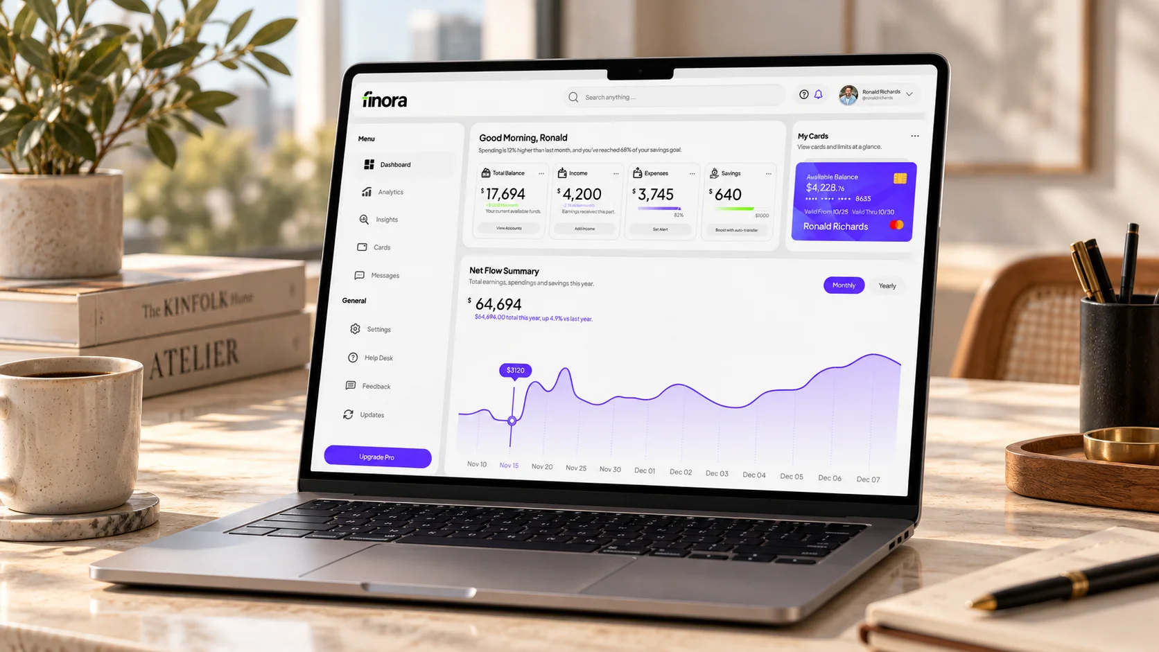
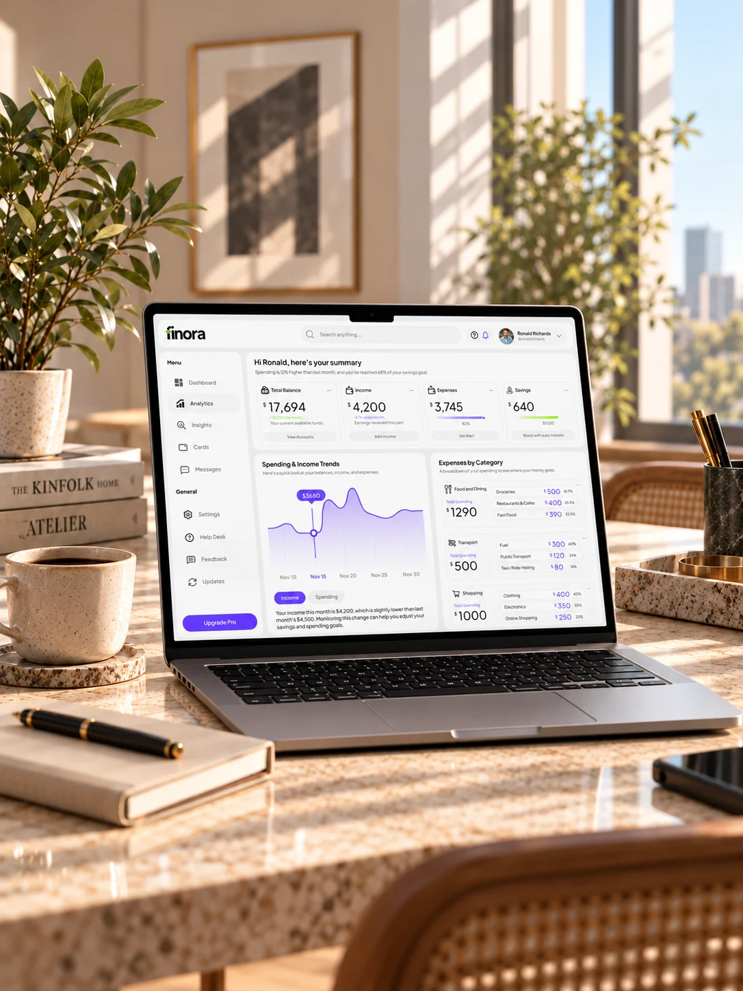
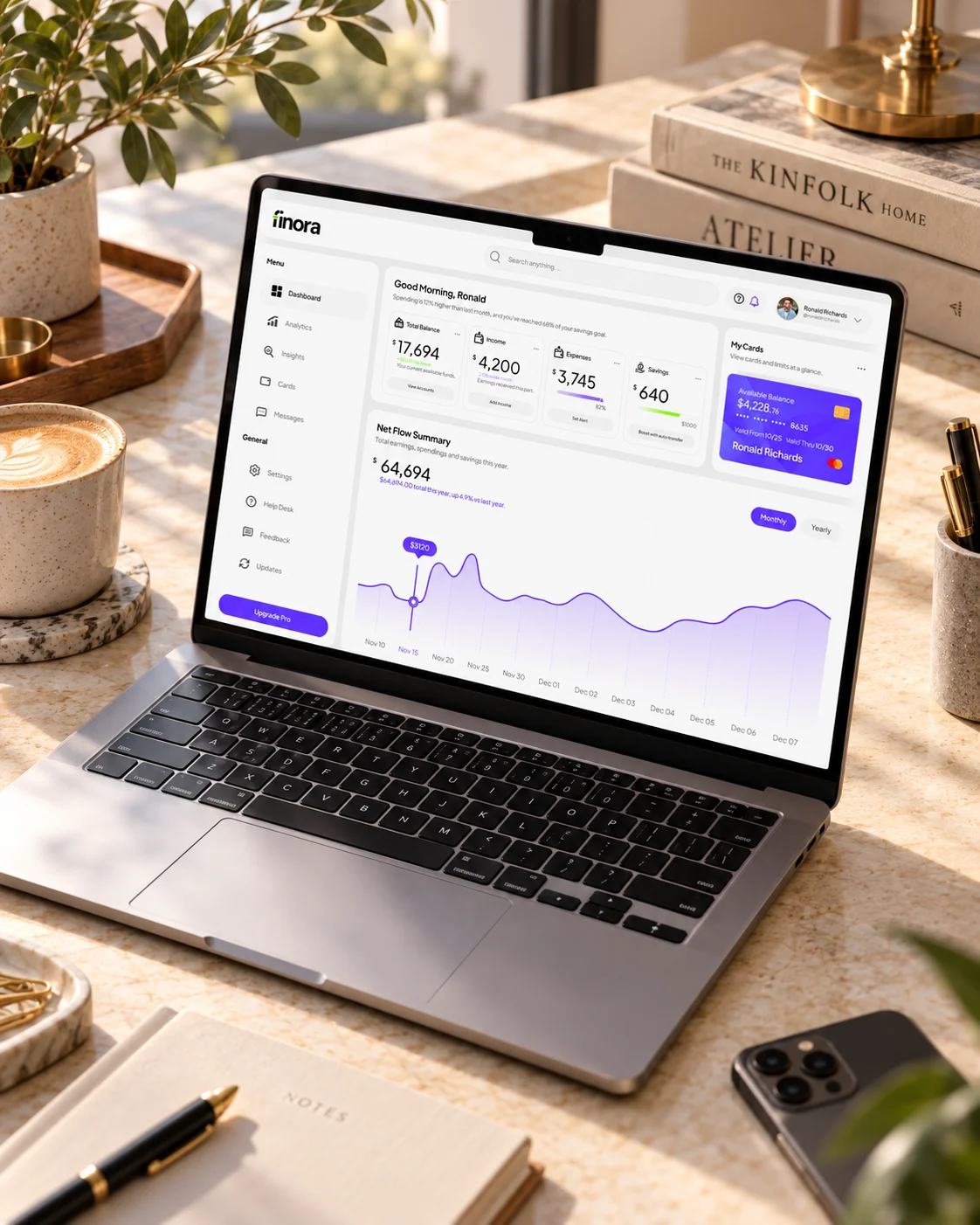
Finora is a fintech dashboard concept that brings balances, income, expenses and savings into a single workspace. Summary cards establish a financial overview, while a net-flow chart introduces a view of change over time. Card information sits alongside the analytical content.
01 — Challenge
Financial summaries can become a field of competing numbers. Finora needed a hierarchy that makes headline information easy to locate while preserving the space and context required to read a chart.
02 — Approach
The interface groups primary metrics into comparable modules and gives the main analytical view a larger canvas. Shared labels, spacing and chart treatment create continuity between individual figures and the broader financial picture. A separate card area keeps account context visible.
03 — Outcome
The resulting concept balances a concise financial snapshot with room for closer inspection. Its modular layout establishes a consistent relationship between summary data, analytical detail and card information.
Next project