UX
Products do not exist as perfect static screens. They exist across loading, empty, error, success, permission and edge-case states.
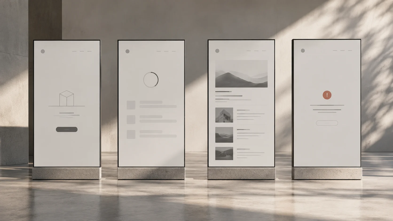
A screen showing complete data is a useful design artifact. It is also a carefully selected moment. The person is signed in, the connection works, the content fits and every dependency has returned the expected result.
Real products move through less orderly conditions. Information arrives late. Permissions change. A search produces no matches. A save succeeds on the server while the response fails to reach the browser.
Product states describe the conditions an experience can occupy and the actions available in each one. Designing those states makes the interface more than a picture of success. It gives designers, developers and QA a shared account of how the product should behave.
Start with a task and follow its transitions
Choose a task such as inviting a colleague, uploading a document or editing a record. Identify the starting condition, the action, the pending work and the possible outcomes. Then ask how a person moves between them.
For a document upload, the states might include no file selected, file selected, uploading, processing, ready and failed. The transitions matter as much as the states. Can someone replace the file during processing? Can they cancel? What remains if the connection drops?
A static screen cannot answer all of this. A short state description can. Record what the system knows, what the user sees, which actions are available and how recovery works. Use diagrams only where they make the relationships easier to understand.
Do not attempt every theoretical combination at once. Begin with likely paths and consequential failures, then investigate interactions between them. The purpose is to expose decisions, not create an unmanageable matrix.
Default, first-time and returning states are different
A default view assumes a particular starting point. Make that assumption explicit. A first-time user may need an explanation of what the product contains and how to begin. A returning user may need to resume unfinished work immediately.
An empty project list illustrates the difference. For a new account, it can explain what a project is and offer a first action. For an established account, emptiness may mean a filter excludes the existing projects or access has changed.
Those situations should not share the same message merely because both contain zero rows. “Create your first project” would be misleading for someone whose projects are temporarily unavailable.
Design empty states around their cause. Distinguish nothing created, no results, no access and unavailable data. Each condition supports a different next step and a different level of reassurance.
Loading and partial states need truthful information
A loading state tells people that work is happening. Decide which parts of the interface remain usable and whether existing information stays visible. Replacing the entire page with a spinner may unnecessarily interrupt a task when only one section is updating.
Partial data needs a visible boundary. If a summary excludes an unavailable source, the product should not present it as a complete total. A section-level message can explain what is missing while preserving the information that is available.
Loading feedback also needs a point at which it changes. An indefinitely animated indicator offers little help when the request is no longer progressing. Define what the product can establish, when it offers recovery and what happens to user input.
Avoid progress claims the implementation cannot support. A simple description of the current operation is more useful than a precise-looking percentage disconnected from actual completion.
Success should confirm the right thing
“Done” can conceal several meanings: accepted, saved locally, queued for processing or completed remotely. The success state should match the operation the product has actually confirmed.
After an invitation is sent, the interface might show that delivery was requested while the colleague has not yet joined. After a document is uploaded, processing may still be required. These distinctions help people decide whether to wait, continue or check later.
Success should also preserve orientation. Show the updated object or explain where it can be found. A brief notification can supplement that state, but it should not be the only record of a consequential change.
Consider repeat actions. If someone submits again because the first response was unclear, the product should avoid creating duplicates where possible. Clear feedback and robust implementation support the same user need.
Errors need a recovery path
An error state should identify what failed, preserve what can be preserved and offer a useful next step. A generic failure message may be unavoidable when the cause is unknown, but the product can still explain what remains safe to do.
Distinguish invalid input from a service problem. Asking someone to recheck a correctly entered address will not fix an unavailable server. Similarly, a retry action should not erase a form unless restarting is genuinely necessary.
Offline behavior deserves an explicit decision. Can the user continue editing? Are changes saved locally? When will synchronization occur? If offline work is unsupported, explain that boundary before the person invests effort the product cannot retain.
Permission states need equal care. A disabled control can communicate that an action exists, but it should explain why it is unavailable when that information is appropriate. Do not reveal protected content merely to explain missing access.
Destructive actions require context and continuity
Before deletion, make the scope understandable. Is the user removing a local reference, leaving a shared space or deleting the underlying record for everyone? Similar labels can conceal different consequences.
Choose confirmation and undo behavior according to risk and reversibility. An easily recoverable action may benefit from undo. An irreversible action may require review before commitment. The state after deletion should explain what happened and where the user is now.
Transitions also affect accessibility. Define focus after a dialog closes, after an item disappears and when validation fails. Important status changes should be available to assistive technology, not communicated only through motion or color.
Use states as a shared product contract
For each important state, agree on content, available actions, persistence and recovery with developers. QA can turn those decisions into realistic scenarios, including delayed responses and permission changes during a task.
Reusable state patterns also strengthen a design system. The team can share validation behavior, empty-state structures and recovery rules rather than inventing them for every feature. This helps prevent the accumulation of UX debt across workflows.
In your next review, begin with a task that does not go perfectly. Follow it until the user reaches a stable, understandable outcome. The gaps you find are part of the product design, even if they never appear in the portfolio screenshot.